Table
I am refering here to the use of tables in web pages to organize data, rather than the 'old' pre-css use for page layout.
Therefore I will examine the various ways tables can be organized, and the type of coding both in the html and in the css that is used to achieve... Some screen-captures will be provided to illustrate various table types.
Ref: http://www.w3schools.com/css/css_table.asp
Table Borders
To specify table borders in CSS, use the border property.
The example below specifies a black border for table, th, and td elements:
table, th, td{border: 1px solid black;}
Notice that the table in the example above has double borders. This is because both the table and the th/td elements have separate borders.
Collapse Borders
To display a single border for the table, use the border-collapse property.
The border-collapse property sets whether the table borders are collapsed into a single border or separated:
table{border-collapse:collapse;}
table,th, td{border: 1px solid black;}
Table Width and Height
Width and height of a table is defined by the width and height properties.
The example below sets the width of the table to 100%, and the height of the th elements to 50px:
table {width:100%;}
th{height:50px;}
Table Text Alignment
The text in a table is aligned with the text-align and vertical-align properties.
The text-align property sets the horizontal alignment, like left, right, or center:
td {text-align:right;}
The vertical-align property sets the vertical alignment, like top, bottom, or middle:
td{height:50px;vertical-align:bottom;}
Table Padding
To control the space between the border and content in a table, use the padding property on td and th elements:
td{padding:15px;}
Table Color
The example below specifies the color of the borders, and the text and background color of th elements:
table, td, th{border:1px solid green;}
th{background-color:green;color:white;}
Make a fancy table
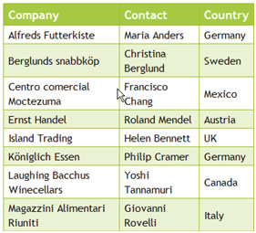
The CSS code is:
#customers{ font-family:"Trebuchet MS", Arial, Helvetica, sans-serif;width:100%;border-collapse:collapse;}#customers td, #customers th{font-size:1em;border:1px solid #98bf21;padding:3px 7px 2px 7px;}
#customers th {font-size:1.1em;text-align:left;padding-top:5px;padding-bottom:4px;background-color:#A7C942;color:#ffffff;}
#customers tr.alt td{color:#000000;background-color:#EAF2D3;}
The html code is:
< table id = "customers">
< tr> and < tr class="alt">
alternating each second line.
Set the position of the table caption.
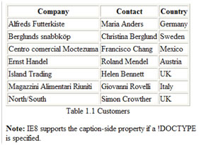
CSS=
caption {caption-side:bottom;}
HTML=
< table border="1">
< caption>Table 1.1 Customers< /caption>
< tr>
< th>Company< /th>
< th>Contact< /th>
< th>Country< /th>
< /tr>
Ref: http://www.w3schools.com/cssref/pr_tab_table-layout.asp
Table Layout.
Sample CSS=table { table-layout:fixed;}
The table layout can be of three types: the default is "auto"; or it can be "inherited" from the parent element; or it can be "fixed":
- The column width is set by the widest unbreakable content in the cells
- Can be slow, since it needs to read through all the content in the table, before determining the final layout
- The horizontal layout only depends on the table's width and the width of the columns, not the contents of the cells
- Allows a browser to lay out the table faster than the automatic table layout
- The browser can begin to display the table once the first row has been received
- Specifies that the value of the table-layout property should be inherited from the parent element.
"auto": Automatic table layout algorithm (this is default):
"fixed": Fixed table layout algorithm:
"inherit"
Ref: http://coding.smashingmagazine.com/2008/08/13/top-10-css-table-designs/
Various CSS Table Designs
1. Horizontal Minimalist
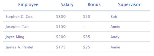
Horizontal tables are tables that are read rather horizontally than vertically. Each entity is represented by a row. You can style these types of tables with minimalist style. Simply set enough padding to the cells (td and th) and put a 2 pixel border underneath the header.
Because horizontal tables are supposed to be scanned horizontally, clearing the border of the table increases the efficiency of the table. The lack of border, however, makes this table design hard to read if it has too many rows. To counter it we simply add 1 pixel border underneath all td elements:
2. Vertical Minimalist

Although rarely used, vertically oriented tables are useful for categorizing or comparing descriptions of objects, with each entity represented by a column. We can style it in minimalistic style by adding whitespace separators between columns.
3. Box
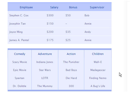
The most dependable of all styles, the box style works for all kinds of tables. Pick a good color scheme and then distribute background-color to all the cells. Don’t forget to accentuate the differences of each cell by defining border as a separator.
This style is nowadays probably the most used style. The tricky part is actually trying to find the color scheme that matches with your site. If your site is heavy on graphics, it will be pretty hard to use this style.
4. Horizontal Zebra
Zebra-tables are pretty attractive and usable. The alternating background color can serve as a visual cue for people when scanning the table. To style a table as zebra, simply put a class="odd" to every odd ordered tr tag and define a style for it (e.g. using if ($count % 2) then even class else odd class in PHP).
 HTML=
HTML=< tr class="odd">
< td>...
< /tr>
< tr>
< td>...< /td>
< /tr>
Important!
Do not put too much contrast on the zebra colors, you can blind your users.
The zebra pattern can help people to scan the table
Cons
Adding class="odd" manually can be very tedious for large tables, many content management systems do not provide even/odd features on a table loop, hence picking the color scheme may be tricky.
5. Vertical Zebra Style
Vertical zebra is easier to style than the horizontal one, as we can make use of colgroup and col elements to distribute column classes. However, the markup becomes a little bit heavier:
HTML=< table>
< !-- Colgroup -->
< colgroup>
< col class="vzebra-odd">
< col class="vzebra-even">
< col class="vzebra-odd">
< col class="vzebra-even">
< /colgroup>
< !-- Table header -->
< thead>
< tr>
< th scope="col" id="vzebra-comedy">Employee< /th>
< /tr>
< /thead>
< /table>
The colgroup element actually applies a style or class to the table, columnwise. Instead of tediously applying class for the first td or th element, we can use a more convenient colgroup-tag. For more information about colgroup visit this page.

6. One Column Emphasis
In some tables, some particular column may have a higher weight than the other columns. If that’s the case, you can use colgroup and col to make that particular column stand out. In the example below, the first column serves as the starting point to read, so it is emphasized, just like we emphasize the first letter of the paragraph as drop caps:

You can also use one-column-emphasis-technique to highlight something important, say the column containing totals of an accounting table, or in a comparison table — for computer specification perhaps, the winning entity (column).
7. Newspaper
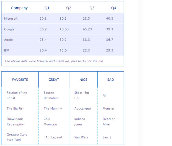
To achieve the so-called newspaper effect, apply border to table element and play with the cells inside. A quick, minimalistic newspaper style can look like this:

Here area few other Newspaper" designs - explore, experiment and create!
8. Rounded Corner
Rounded corners are slick and modern, and it’s easy to apply it to a table, although you need to fire up Photoshop for this. Create images for all four corners of your table. Theoretically, we can make use of the nesting tr and td-elements to place the left and right corners of the table without adding additional markup. Unfortunately, IE 6 goes berserk and the table appears ugly, so the most stable way to do this is to put ID or class to all four corner cells of the table. Please consider the example below:

Pros
Great if you want untraditional table, probably the only viable option you have if your website uses rounded corners heavily
Cons
Takes longer to style, requires images
Play With
Color scheme, corner variations, typography, tr:hover effects, icons
9. Table Background
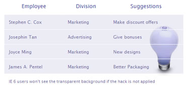
If you are looking for a quick and unique way to style your table, simply pick an attractive image or photo related to the subject of your table and set it to be the background-image of the table.
You can add 50% grey png-image as background-image of the cells to improve readability, and that means that you need a CSS-hack to make it work in IE 6:
The table would look like this:
Important!
Make sure the image is relevant to the table’s contents
Pros
Very easy to style, delivers unique look, if used correctly the image can serve as a symbol that gives outstanding impression on the viewer
Cons
Needs hack to get the background work in IE 6, needs images
Play With
Background images, transparent PNGs, typography, colors, icons
10. Cell Background
You can apply background-image to the cells and achieve a consistent look. Say you have at least half an hour to spare and you want something that’s not too bland. Start your Photoshop and make 1 pixel width gradients, and set them as background-image of all cells. You’ll end up with a gradient style table:
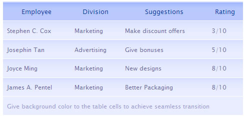
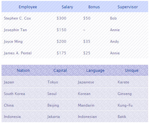
Similarly, pick a pattern and set it as background-image and you’ll end up with a pattern-styled-table:
Important!
Make sure the text stands out against the background
Pros
Easy to style, not too bland
Cons
Uses images, patterns and gradients might distract reading
Play With
Color scheme, patterns, typography, borders, backgrounds, gradients, icons
Ref: http://www.htmldog.com/guides/htmladvanced/tables/
The Columns Strike Back
Table rows tend to make table columns look rather stupid. They do all the work, as the table is built row by row, leaving the columns feeling quite dejected.
Luckily for those eager columns though, the colgroup and col tags have come to their rescue.
These tags allow you to define the table columns and style them as desired, which is particularly useful if you want certain columns aligned or coloured differently, as without this, you need to style individual cells.
Here is an example of these tags in use:
< colgroup>>
< col />>
< col class="alternate" />>
< col />>
< /colgroup>>
< tr>>
< td>This< /td>>
< td>That< /td>>
< td>The other< /td>>
< /tr>>
< tr>>
< td>Ladybird< /td>>
< td>Locust< /td>>
< td>Lunch< /td>>
< /tr>>
< /table>
The styles of the class 'alternate' will be applied to the second column, or the second cell in every row.
You can also use the span attribute on either colgroup or col, in a similar way to rowspan and colspan.
Using it with the colgroup tag will define the number of rows that the column group will belong to, for example < colgroup span="2">< /colgroup> would group the first two columns. When span is used in colgroup, you shouldn't then use col tags.
Using span in the col tag is more sensible, and could, for example, be applied to the above example like this:
< table>
< colgroup>
< col />
< col span="2" class="alternate" />
< /colgroup>
...
This would apply 'alternate' to the last two columns.
Oh, but there had to be a catch, didn't there?
Here it is: The only styles you can apply to columns are borders, backgrounds, width and visibility.
Summary and Caption Interlude
A brief and easy accessibility consideration is to always apply a summary and caption to the table.
A summary can be applied to a table using the summary attribute in the opening table tag. This won't be displayed, but can aid in a non-visual representation of a table.
The caption tag defines the caption straight after the opening table tag. It will appear above the table by default, but can be placed top,right, bottom or left with the caption-side CSS property, although IE won't take any notice of this.
< caption>Locust mating habits< /caption>
...
Headers, footers and the quest for the scrolling table
thead, tfoot and tbody allow you to separate the table into header, footer and body. This is particularly useful for large tables and when printed for example, the header and footer rows should appear on every page.
These elements must be defined in the order thead - tfoot - tbody and would look like this:
< table>
< thead>
< tr>
< td>Header 1< /td>
< td>Header 2< /td>
< td>Header 3< /td>
< /tr>
< /thead>
< tfoot>
< tr>
< td>Footer 1< /td>
< td>Footer 2< /td>
< td>Footer 3< /td>
< /tr>
< /tfoot>
< tbody>
< tr>
< td>Cell 1< /td>
< td>Cell 2< /td>
< td>Cell 3< /td>v
< /tr>
...
< /tbody>
< /table>
You can make the tbody element scroll in Mozilla, by applying the style overflow: auto; max-height: [whatever] to it. You will then see the header and footer kept in place and a vertical scroll bar to the right of the body. You should use the max-height property because IE doesn't recognise it and so it is safer than using the height property, which IE would apply to every row.
Note: Back to normal browser differences, this time IE doesn't have a clue when it comes to headers and footers, and although it renders them in the table, they will not appear at the top and bottom of every printed page, let alone deliver the scrolling table.
Be wary of using scrolling tables. Although they serve a very useful purpose, most users aren't used to them and may believe that the data presented above the line is the only data available.